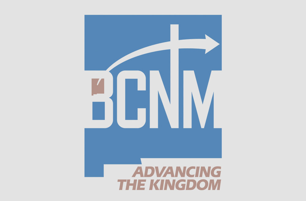
After adopting the theme Advancing the Kingdom, the Baptist Convention of New Mexico turned to BOYDesign to create a new logo, branding elements, graphic standards manual and various corresponding materials. The logo utilizes a simplified, yet recognizable, shape of New Mexico as its foundation. The initials of the convention — BCNM — are reversed out of the state from border to border representing the convention’s primary focus is New Mexico and its people. A smaller version of New Mexico fills the counter at the top of the “B” with an arrow extending outward across the state, emphasizing its reach beyond New Mexico, across the United States and around the world. The arrow also transects the elongated ascender of the “N” to create a cross, reinforcing the objective: Advancing the Kingdom of God.