BOYDesign created a logo and promotional materials for Meridian University of Biblical Training upon its founding in 2003. When the school’s headquarters returned to Oklahoma City in 2020, it seemed like the perfect time for rebranding. Its new logo is inspired by its name and mission.
In the morning, before noon, it is a.m. — “ante meridian.” In the afternoon it is p.m. — “post meridian.” In between a.m. and p.m. is “meridian,” when the sun is at its zenith. Meridian is light at its brightest. Meridian also refers to the lines of longitude on the earth. Meridian University has definite lines drawn when it comes to its beliefs and purpose, therefore, it is a light shown and a line drawn. The globe (with its meridian lines) speaks to Meridian University’s global vision and stance on God’s Word. The sun at its zenith (at meridian) speaks to Meridian University’s goal to shine the light of God’s Word on the nations.
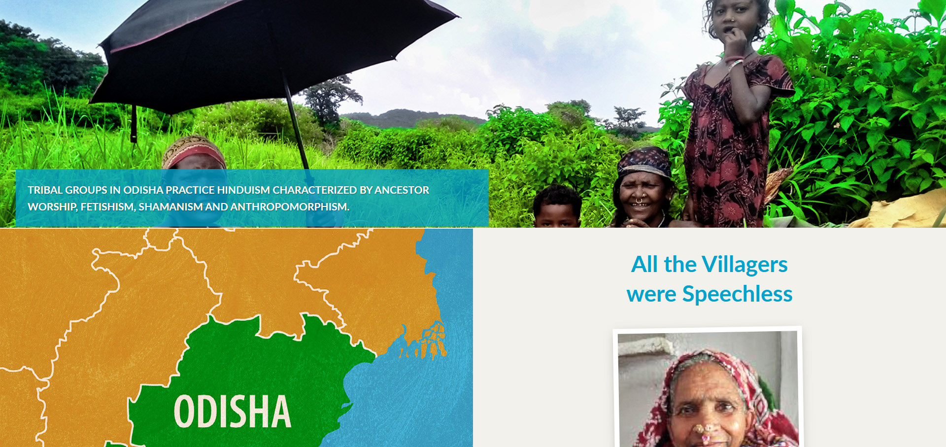
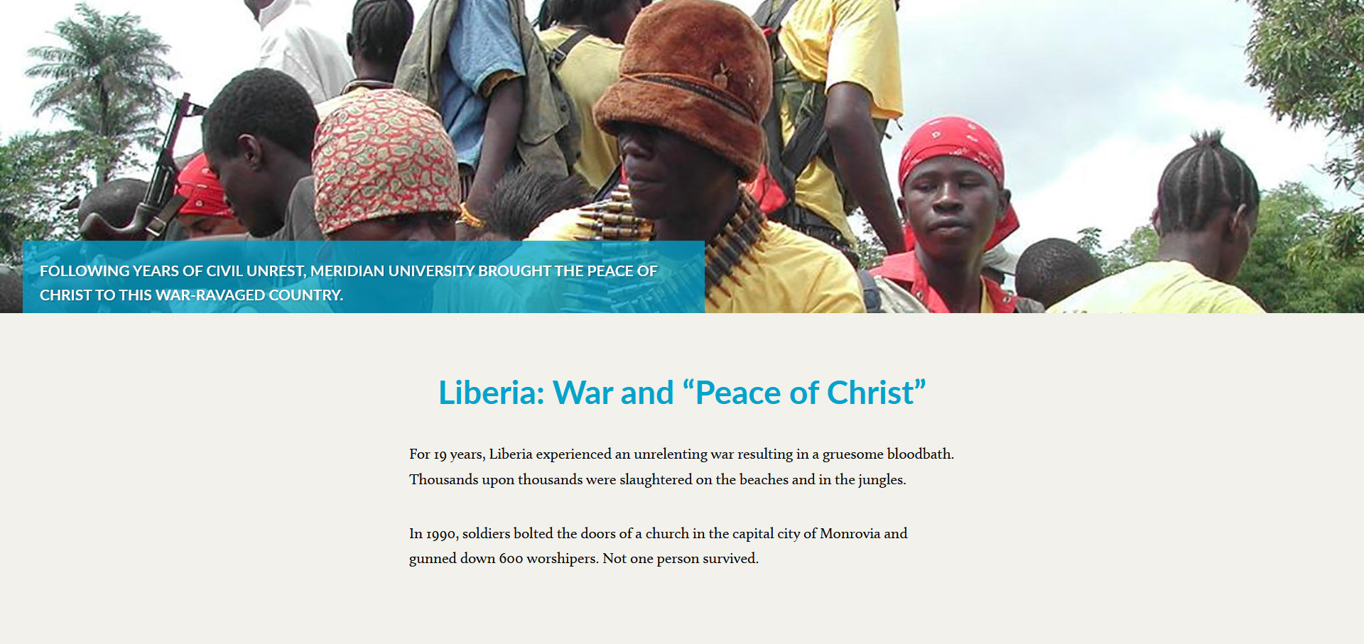
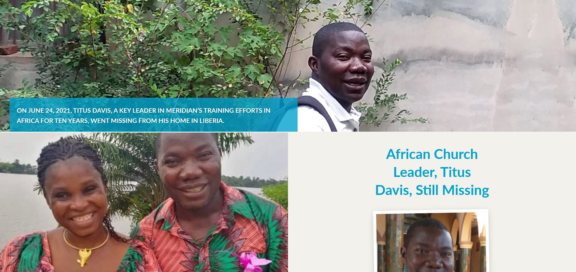
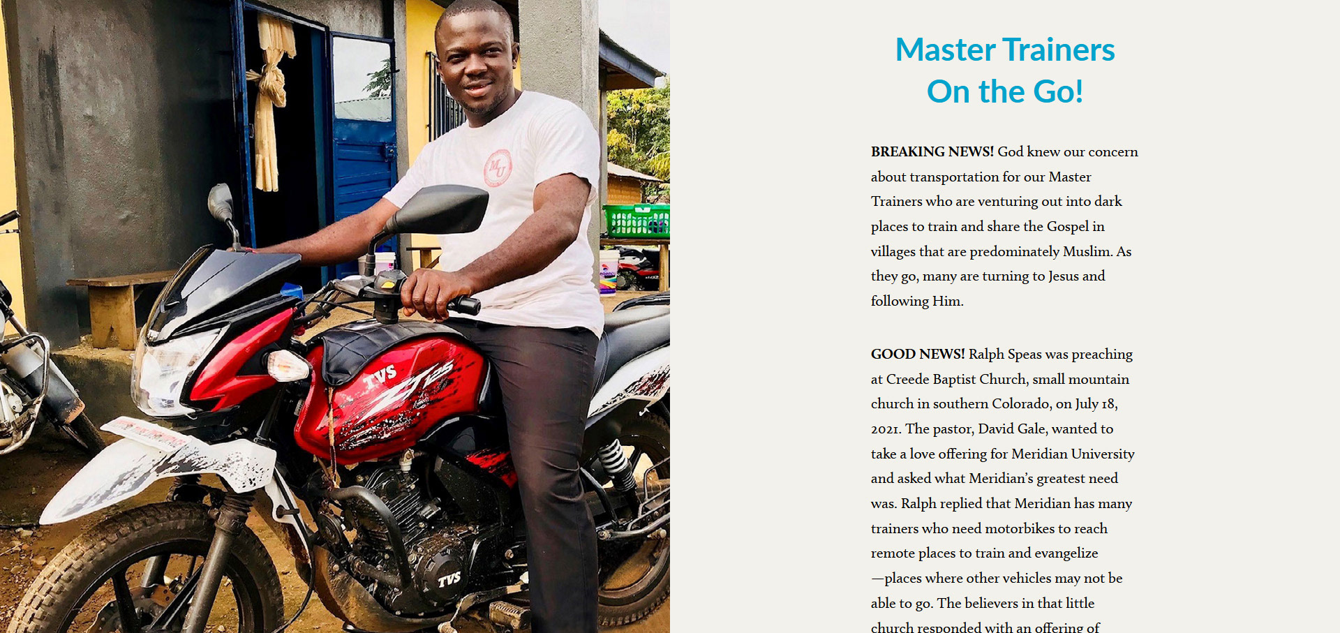
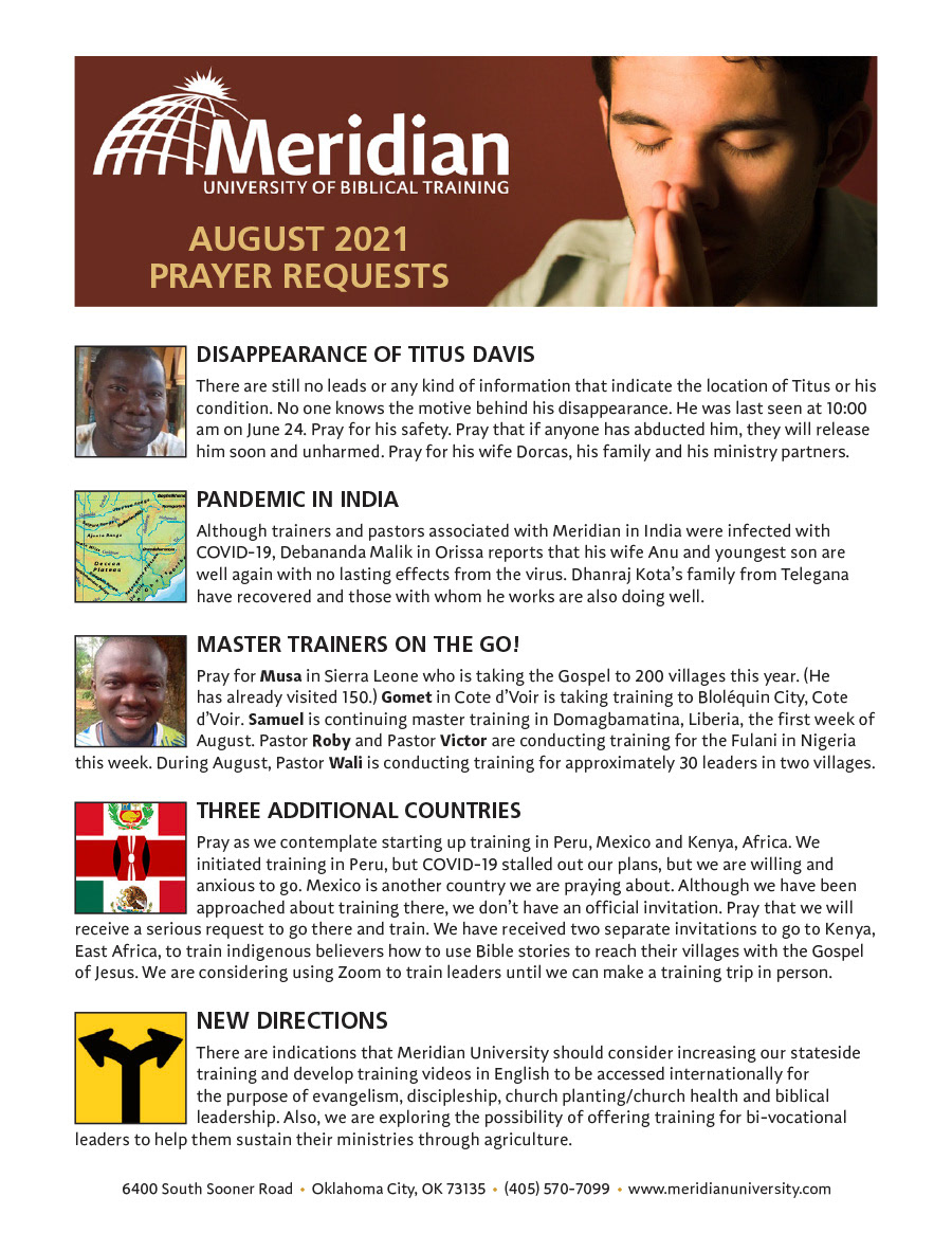
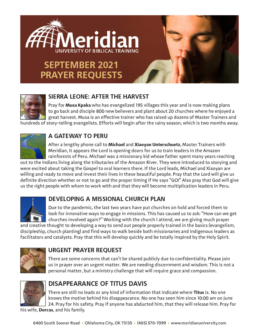
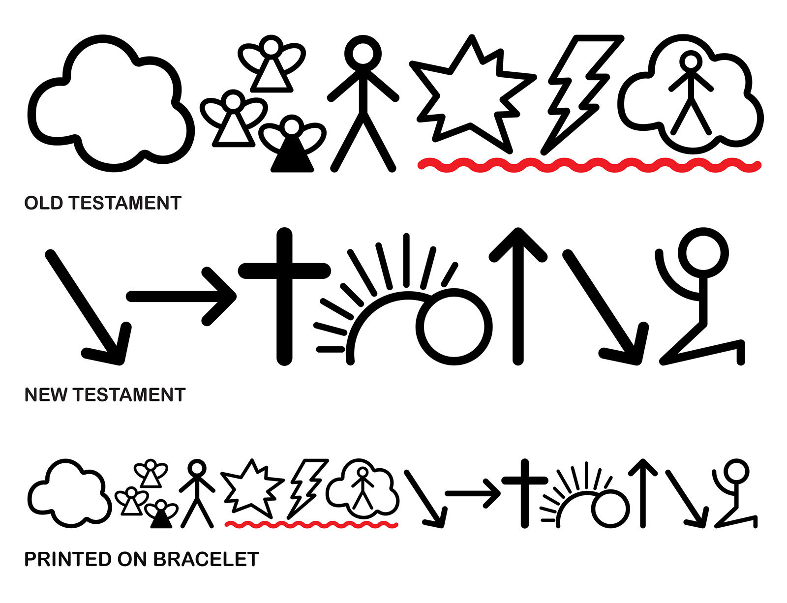
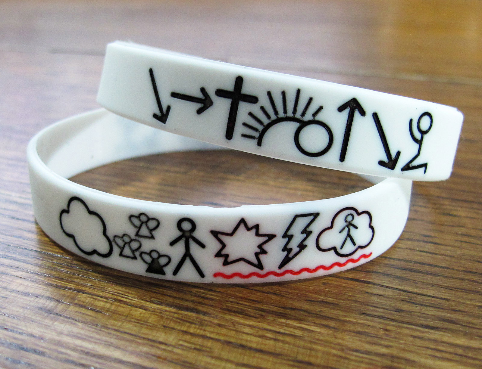
Monthly communication resources were created including an online interactive newsletter, ministry stories and prayer requests. Since much of MUBT’s work is sharing Bible stories with people groups who are illiterate or have an oral traditional and no written language, a bracelet was created using basic symbols to share the Bible from Genesis through the Gospel to Christ’s return.
Click on the dates below to read that month's online newsletter.
